Have you ever tried buying a shirt online, only to find yourself frantically tapping the “Remove from Cart” button that just won’t respond? You keep pressing it harder and harder, but nothing happens. The button’s there, taunting you, while your cart total keeps showing that extra shirt you never wanted.
Or maybe you’ve landed on a news site during your morning commute. There’s a breaking story you need to read, but where’s the menu? You scroll up and down looking for those familiar three lines – the hamburger menu – but it’s nowhere to be found. The text is so tiny you have to zoom in, but then half the content disappears off your screen.
The frustration peaks when you’re browsing a recipe site. You know exactly what dish you want to make, but there’s no search bar in sight. You’re forced to endlessly scroll through hundreds of recipes, your thumb getting tired, your patience wearing thin. The search icon that’s clearly visible on desktop has mysteriously vanished on mobile.
Ask yourself: if this is how your customers feel when they visit your website on their phones, what’s it costing you? Every time someone gives up because they can’t navigate your site, you lose a potential sale. Every person who bounces because your text is unreadable or your buttons don’t work is a customer who might never return. Your website might look perfect on your desktop monitor, but most of your visitors are probably viewing it through a much smaller screen.

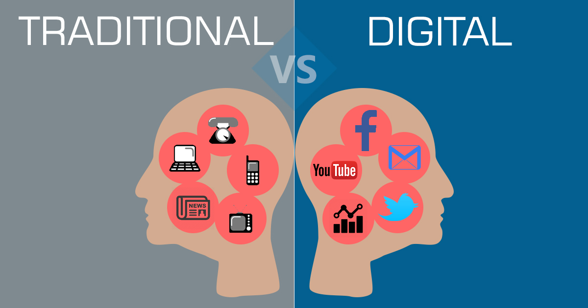
7.1 Billion Mobile Users Worldwide
Let’s put this in perspective: 7.1 billion mobile users worldwide – that’s not just a number, it’s basically everyone you know and everyone they know. Think about your daily routine. You wake up, check your phone. Lunch break? You’re browsing on your phone. Waiting for the bus? Phone. Even when you’re watching TV, chances are you’re also scrolling through your phone. Now multiply this behavior by 7.1 billion people. That’s the reality of today’s world.
When 90% of the global population is reaching for their phones to access the internet, ignoring mobile optimization isn’t just an oversight – it’s like putting up a “We Don’t Want Your Business” sign. Imagine running a physical store where 9 out of 10 customers have to crawl through the entrance because the door is too small. That’s exactly what a non-mobile-friendly website does to your visitors. They squint, pinch, zoom, and eventually leave in frustration.
A mobile-friendly site means that regardless of the device used, it would always be good. This will play an important role in ensuring that when people interact with your website, the use of the website directly touches your brand. Slow loading speeds, tricky navigation, and poorly displayed content frustrate users and could make them leave the site. Indeed, research has covered that nearly half of all users anticipate a site to load in two seconds and even more will bounce if longer. Ensuring your website is mobile-friendly will improve user satisfaction, and this trust earned with prospects will go a long way in determining whether or not to proceed further with your brand.
54.4% Of Global Website Traffic Comes From Mobile Devices
Let’s get even more real: 54.4% of global website traffic comes from mobile devices. That means if 1,000 people visit your website today, around 544 of them are viewing it on their phones. Now picture this: you’re hungry, it’s late, and you open a food delivery app on your phone. The menu categories are squeezed together so tightly that every time you try to tap “Pizza,” you accidentally hit “Pasta.” The product images load halfway, the “Add to Cart” button is playing hide and seek, and when you finally manage to fill your cart, the checkout button is cut off at the bottom of the screen.
What do you do? Probably what most people do – close the app and order from somewhere else. That’s the harsh reality for websites that ignore mobile optimization. Every pinch-to-zoom moment, every misclicked button, every cut-off image is pushing potential customers straight into your competitors’ arms.
Think about food delivery websites – they’re the perfect example. When someone’s ordering food on their phone, they’re usually hungry, maybe tired, and definitely don’t have the patience to deal with a clunky website. The menu needs to be instantly accessible. Categories should be clear and tappable with normal-sized fingers. Order customization options need to work smoothly. The cart should be easily editable, and the checkout process should be seamless. Miss any of these marks with poor mobile optimization, and you’re not just losing one order – you’re likely losing that customer forever.
Each frustrated tap, each abandoned cart, each exit from your non-optimized site represents real money walking away from your business. And with mobile traffic continuing to grow, this isn’t a problem that’s going away – it’s only getting bigger.
Waste Of Clicks and Money On Social Media Ads
Think about it: your marketing team just crafted the perfect Instagram ad. The visuals are stunning, the copy is compelling, and you’re watching those ad dollars turn into clicks. But here’s the painful truth – every single person clicking that ad is probably holding a phone in their hand. They see your ad while scrolling through their Instagram feed during their morning coffee, lunch break, or evening commute. They’re interested enough to tap on it. And then… they land on your website.
Instead of the seamless experience they expected, they’re greeted by a desktop site crammed onto their phone screen. That product they saw in your ad? It’s buried somewhere in your non-responsive navigation. The text is microscopic. Images are either enormous, taking forever to load, or so small they’re meaningless. The ‘Buy Now’ button? It’s there somewhere, probably hiding under a misaligned menu or floating off-screen.
Let’s talk money. Every ad click costs you. Facebook, Instagram, TikTok – none of them give discounts for poor user experience. You’re paying full price for each visitor, whether they can use your site or not. If you’re running a campaign at $2 per click, and 100 mobile users click through only to find an unusable website, that’s $200 down the drain. Multiply that across days, weeks, and months of advertising, and you’re essentially paying to frustrate potential customers.
Picture this: Someone sees your fashion brand’s ad on Instagram. Your $50 shirts look amazing in the carousel ad. They click through, ready to buy, credit card in hand. But on your non-optimized site, the size selector doesn’t work on mobile, the color swatches are too small to tap, and the shopping cart is a mess of overlapping elements. That’s not just one lost sale – that’s wasted ad spend, a damaged brand reputation, and a potential customer who’s now associating your brand with frustration rather than fashion.
Bounce Rate: The Silent Revenue Killer
You’ve probably heard the term “bounce rate,” but let’s make it painfully real. When 73.1% of web designers identify non-responsive design as a top reason for visitors leaving a site, they’re not just sharing an opinion – they’re describing a business emergency. Let me paint the complete picture of what happens when someone lands on your non-mobile-optimized site:
First, there’s the loading time. Mobile users often access sites through variable connection speeds. Your desktop-optimized images, which look gorgeous on a 27-inch monitor, are now crushing their mobile bandwidth. Every extra second of loading time increases the chance they’ll leave. But let’s say they’re patient and wait.
Then comes the navigation nightmare. Your main menu, neatly spread across a desktop header, is now either impossibly small or broken into unrecognizable pieces. The user tries to tap the “Products” link, but hits “About Us” instead because the touch targets are too close together. They attempt to pinch and zoom, accidentally activating some hover effect that was never designed for mobile.
Assuming they make it to your product catalog, the real frustration begins. The filter sidebar that works so well on desktop is now floating somewhere in mobile limbo. Want to filter by size, color, or price? Good luck. The dropdown menus either don’t respond to touches or open up in ways that cover the actual products. Product images, not properly scaled for mobile, either pixelate when enlarged or load so slowly that customers give up.
The search functionality, if it exists at all on mobile, is often hidden behind icons that don’t respond to taps. Users can see there are hundreds of products, but have no way to find the specific one they want. It’s like walking into a massive store where all the aisle signs are written in microscopic text, and the store directory is stuck to the ceiling.
Let’s talk about forms and checkout processes. Mobile users trying to complete a purchase face text fields that don’t properly align with their phone’s keyboard. Autocomplete functions fail. Credit card input fields are poorly formatted for mobile number pads. The “Submit” button keeps shifting position as the page elements load and reload.
Shopping cart management becomes a test of patience. Trying to update quantities? The buttons are too small to tap accurately. Want to remove an item? The ‘X’ button is either non-responsive or so close to other elements that users accidentally tap the wrong thing. The cart total keeps disappearing off-screen, forcing users to scroll up and down constantly to see how their changes affect the final price.
And then there’s the critical moment – checkout. Payment buttons aren’t optimized for mobile tap targets. Security badges and trust indicators, crucial for conversion, are either missing or rendered unreadable on mobile screens. Users can’t easily review their order summary because half the table is off-screen. Shipping address forms aren’t mobile-optimized, making it tedious to enter basic information.
Each of these friction points isn’t just an inconvenience – it’s a potential exit point. Every user who bounces represents not just a lost immediate sale, but potentially a lifetime of lost revenue. They’re unlikely to return, and worse, they might share their frustrating experience with others. In today’s connected world, a poor mobile experience doesn’t just lose you one customer – it can create a ripple effect of lost opportunities.
Mobile Commerce: The Multi-Trillion Dollar Reality Check
One of the most serious trends in digital marketing over the years has been the rise in mobile commerce, popularly known as m-commerce. Consumers have now started making regular purchases through their smartphones, and mobile commerce sales are likely to grow further. Social Media Advertising: Paying for Disappointment?
Let’s talk numbers that should make every business owner sit up straight: $6.6 trillion. That’s not a typo – that’s the projected value of the global mobile commerce market by the end of 2024. To put that in perspective, that’s more than the GDP of many countries combined. And here’s the kicker: $2.2 trillion of that is purely from mobile e-commerce. These aren’t just impressive numbers – they’re a wake-up call.
Think about this: The average mobile purchase is hovering around $120. These aren’t just small impulse buys – people are making serious purchases on their phones. From 2021 to 2025, mobile commerce sales are expected to nearly double from $362 billion to over $710 billion. This isn’t just growth; it’s an explosion.
But here’s where it gets personal for your business: Every dollar of that growth is going somewhere. If your website isn’t mobile-optimized, it’s going to your competitors. While you’re hesitating to invest in mobile optimization, thinking it’s just an optional upgrade, your competitors are creating smooth, seamless mobile experiences that capture these billions in sales.
Let’s break this down to day-to-day reality: People are buying furniture, booking vacations, ordering weekly groceries, and making investment decisions – all from their phones. If your site makes them pinch and zoom just to read product descriptions or frustrates them with a broken checkout process, you’re not just losing today’s sale. You’re losing their future business too.
The shift to mobile commerce isn’t just a trend – it’s a fundamental change in consumer behavior. When we’re looking at a market doubling in size in just four years, that’s not something you can afford to ignore or put off until later. Every day your website isn’t mobile-optimized is a day you’re essentially telling customers, “We don’t want your business.”
Any businesses failing to optimize their website for mobile phones will surely miss such lucrative opportunities. Mobile optimization offers customers ease of browsing the products, reading reviews of any product, and finally closing the transaction on phones, hence increasing sales and conversion rates. A seamless mobile shopping experience helps to increase customer loyalty; users are likely to return to a site that offers a seamless mobile user experience.
Responsive Design vs. Mobile-Only Websites
The point of mobile optimization narrows down to a choice that a company has to make: responsive web design or a separate website for mobile phones. Responsive design is thus advisable because it ensures the website automatically adjusts with each particular screen size of the devices and creates similar experiences across multiple devices. It can keep the business on one website that functions well on desktops and mobile phones, which makes it easier to manage and keep up to date. On the other hand, mobile-only websites can be quite expensive and complicated to handle since they require a different set of content and designs for different devices. Responsive design probably holds the best premise for most businesses by balancing power with usability and cost.
Mobile Optimization in Brand Reputation
The reputation of a business can be largely shrouded in the functioning of its website on mobile phones. If the consumers experience that using your website is uneasy on mobile, they might switch to some other business, hurting your brand. On the other hand, an easy and fast mobile experience builds trust and loyalty, strengthening positive brand perception. As users use their smartphones for a longer time, this directly equates to raised expectations regarding mobile-friendly websites. Mobile optimization at the fore allows companies to build a much better, more trustworthy brand image that can resonate with today’s mobile-first consumers.
Picture this: A potential customer, let’s call her Sarah, needs to check her bank balance and make a quick transfer. She’s heard great things about Citi Bank’s services and decides to check them out. She pulls out her phone during her lunch break and visits their website.
The site loads, but something’s wrong. The login button is barely visible, squeezed into a corner. She manages to log in, but the account dashboard is a mess on her phone screen. Numbers overlap, buttons don’t respond, and when she tries to make a transfer, the form keeps jumping around as she types. After 15 minutes of frustration, she gives up.
What happens next? Sarah doesn’t just quietly move on. She pulls up Reddit and posts about her experience in r/personalfinance: “Tried using Citi Bank’s mobile site – what a nightmare!” The post gains traction. Others share similar experiences. Someone makes a meme about it that gets shared on Twitter.
At lunch with colleagues, the topic of banking comes up. “Whatever you do, don’t try using Citi’s website on your phone,” Sarah warns. Her coworkers share this warning with their friends. At family dinner, when her sister mentions she’s looking for a new bank, Sarah immediately advises against Citi, specifically because of her mobile experience.
This isn’t just about one frustrated customer. It’s about the exponential spread of negative brand perception. In an age where people spend hours on their phones and share experiences instantly, a poor mobile experience becomes a public relations issue. Your brand’s reputation isn’t just built through marketing campaigns and official communications anymore – it’s built through every tap, swipe, and pinch-to-zoom moment on your mobile site.
That one frustrating mobile experience has now influenced dozens of potential customers, none of whom will ever even give your brand a chance. They’ve made their decision based on someone else’s negative experience with your mobile site. The damage spreads far beyond the initial interaction, creating a ripple effect that can take years to overcome.
Although it may sound like a buzz phrase, mobile optimization is an absolute must for any serious digital marketing strategy. Companies that invest in mobile-friendly websites and seamlessly integrate mobile experiences for their customers will see superior user engagement, better conversion rates, and enhanced search rankings. As the usage of mobile devices continues to grow, optimization for mobile will be even more important; thus, businesses need to fall in line and move forward with the pace.
SEO: Your Mobile Site Is Mainly Your Site
According to CEO of Searchenginepeople (SEO Mississauga), more recently, the trend has been that the search engines-primarily Google-have favored the listings of mobile-friendly websites in results. Literally speaking, this means Google ranks your site based on the mobile version; thus, if the site is not mobile-friendly, get ready for a lower ranking on the SERPs, hence making it hard for users to find you. A fast-loading website, looking great on all devices, and providing an easy and intuitive feel and browse experience, will bring about higher search rankings, thus much better visibility and more organic traffic. For that reason, mobile optimization affects not only user experience but also your efforts.
Think about this: Google doesn’t see your website the way you do on your desktop monitor anymore. When Google’s crawlers visit your site, they’re essentially viewing it through a mobile phone. This isn’t just a technical detail – it’s a complete shift in how your site exists in the search ecosystem.
Let’s get brutally honest about what this means: If your mobile site is broken, as far as Google is concerned, your entire site is broken. That beautifully designed desktop version? It might as well not exist. When Google primarily indexes the mobile version of your site, any content that’s hidden, broken, or poorly formatted on mobile simply disappears from search results.
Consider this scenario: You’ve written an amazing product description that appears perfectly on desktop. But on mobile, it’s truncated or hidden behind a malfunctioning “Read More” button. Guess what? Google won’t index that hidden content. Your carefully crafted SEO strategy just went out the window because of poor mobile optimization.
But it’s not just Google anymore. Bing has adopted the same mobile-first approach, and here’s where it gets even more interesting: SearchGPT and other AI-powered search tools are building on top of these results. Think of it as a chain reaction: Your non-mobile-friendly site ranks poorly on Bing, which means it’s less likely to appear in SearchGPT results, which means you’re invisible to users of next-generation search tools.
The impact goes beyond just rankings. Mobile-friendly sites typically have better engagement metrics – lower bounce rates, longer session durations, and higher page views. These are all signals that search engines use to determine your site’s value to users. When mobile users can’t navigate your site easily, these metrics suffer, creating a negative feedback loop that further hurts your search rankings.
Here’s a real-world example: A local restaurant might have their full menu, prices, and hours clearly visible on desktop. But if this information is difficult to access on mobile – maybe it’s in a PDF that won’t load properly or hidden in a broken mobile menu – search engines might not even register this essential information. When someone searches “restaurants near me” on their phone (which is how most people search for local businesses), your restaurant could be invisible in results, regardless of how good your food is.
The rise of voice search adds another layer to this. When someone asks Siri or Alexa about your business, these services pull from mobile-optimized search results. If your site isn’t mobile-friendly, you’re not just missing out on traditional search traffic – you’re missing out on the rapidly growing voice search market too.