
Modern web design choices have a significant impact on a website’s SEO success. A well-designed website does more than attract visitors with its appearance—it ensures that search engines can easily crawl, index, and rank content. Factors like site architecture, mobile responsiveness, page speed, and user experience are all directly influenced by design decisions. However, these elements don’t work in isolation. The tools and platforms you use, the way your content is structured, and the overall experience provided to users all contribute to how search engines perceive your site.
- The Impact of Web Design Structure on SEO Performance
- Site Architecture and Crawlability
- URL Structure and Navigation Clarity
- Mobile Responsiveness and User Experience
- Page Speed and Performance Optimization
- Choosing the Right Platform for SEO-Friendly Web Design
- Webflow – A Design-First, SEO-Friendly Platform
- Wix – Simple SEO Tools for Beginners
- WordPress – Highly Flexible with Extensive SEO Plugins
- Why User Experience and SEO Go Hand in Hand
- The Long-Term Benefits of SEO-Friendly Design
- Conclusion
In this article, we’ll explore the critical connections between web design and SEO. You’ll learn why site structure matters, how different platforms can simplify or complicate SEO efforts, and why a positive user experience goes hand in hand with better search rankings. We’ll also break down key aspects of design that influence long-term SEO success, giving you a clearer understanding of how modern design choices can boost your online visibility.
The Impact of Web Design Structure on SEO Performance
The way a website is structured influences how search engines and users interact with it. A well-organized design makes it easier for search engines to crawl and index pages, leading to better visibility in search results. At the same time, a logical structure improves user experience, ensuring visitors can navigate the site effortlessly. A website that lacks structure can confuse both users and search engines, resulting in lower rankings, higher bounce rates, and lost opportunities for organic traffic. Understanding the connection between web design structure and SEO is essential for building a site that performs well in search rankings.
Below, we’ll explore key aspects of web design structure that directly impact SEO performance.
Site Architecture and Crawlability
A well-planned site architecture ensures that search engines can efficiently crawl and index pages. A flat structure, where important pages are easily accessible within a few clicks from the homepage, allows search engines to reach content quickly. Poorly structured websites with deep or disconnected pages can cause indexing issues, making it difficult for search engines to recognize the importance of certain content.
URL Structure and Navigation Clarity
Clear and consistent URL structures improve SEO by making it easier for both users and search engines to understand the hierarchy of a website. URLs should be descriptive, keyword-friendly, and logically organized. Alongside this, intuitive navigation with clear menus and internal linking helps users find content efficiently while signaling to search engines which pages are most valuable.
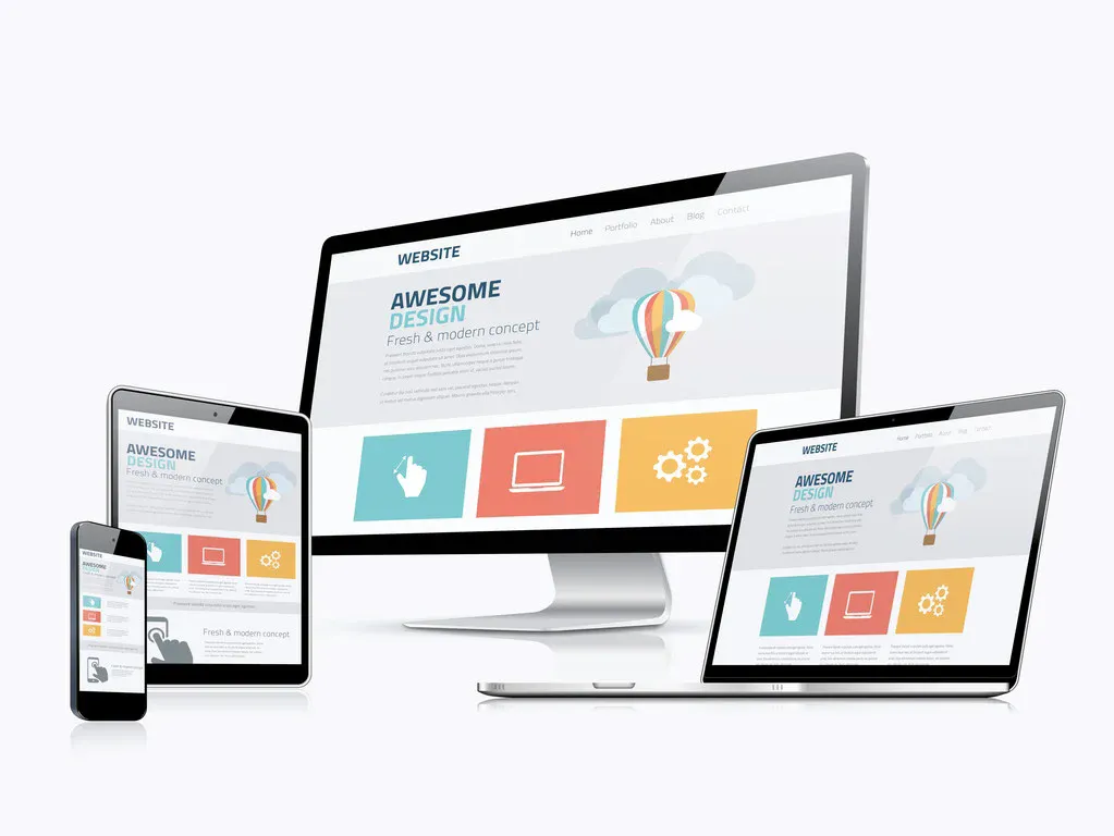
Mobile Responsiveness and User Experience
Search engines prioritize mobile-friendly websites, as mobile usability directly affects ranking performance. A responsive design ensures that a website adapts to different screen sizes, maintaining a seamless experience for visitors. Poor mobile experiences, such as difficult navigation or slow loading times, can lead to higher bounce rates and lower rankings.
Page Speed and Performance Optimization
Fast-loading websites provide a better user experience and are favored by search engines. Site speed is influenced by factors such as image optimization, efficient coding, and proper use of caching. Slow websites discourage visitors, leading to increased bounce rates and missed opportunities for engagement and conversions.
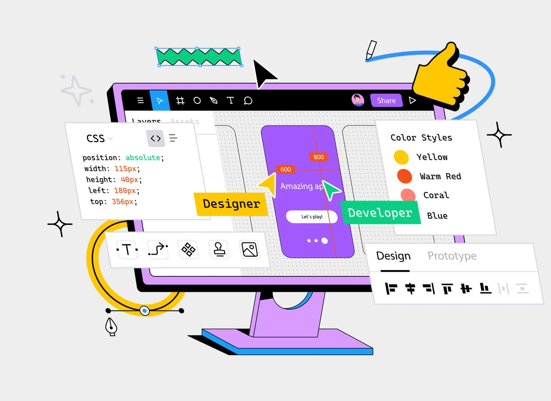
Choosing the Right Platform for SEO-Friendly Web Design
Selecting the right platform for your website is critical to long-term SEO success. Your platform has a large impact on implementing SEO best practices and optimizing the technical aspects of your website. A good platform should make SEO easier, enhance performance, and provide a user-friendly experience that allows for improved search engine rankings.
Why the right platform matters for SEO:
- Improved Crawlability and Indexing: A well-structured platform allows search engines to crawl and index your website more efficiently.
- Inbuilt SEO Tools: Most platforms come with inbuilt SEO tools, which make optimization simpler.
- Mobile Responsiveness: Mobile-responsive platforms ensure better rankings on mobile-first index searches.
- Improved Load Times: Fast-loading websites improve user experience and SEO performance.
- Simpler Technical SEO Management: Sites with editable meta tags and URL structures assist in technically optimizing your site.
- SEO-Friendly Content Management: A platform that facilitates flexible content management simplifies on-page SEO.
Webflow – A Design-First, SEO-Friendly Platform
Webflow provides a balanced mix of design freedom and SEO functionality, enabling companies to develop fully responsive sites with clean code. The software includes necessary tools like customizable meta tags, alt text, and control over the URL structure. Webflow’s strong focus on SEO optimization makes it an excellent choice, and with the help of the best Webflow agencies, businesses can maximize its potential for both design and search engine performance. Its user-friendly interface offers an easy way for non-coders to create quality sites with solid SEO foundations.
Wix – Simple SEO Tools for Beginners
Wix is also a great option for someone who wants a website builder with simple SEO features built-in. It comes with an SEO Wizard to help optimize content, mobile optimization, and adjustable meta tags. Less flexible than other sites, Wix is perfect for someone who needs a simple-to-reach platform with the core SEO tools. It allows businesses to create an SEO-optimized site with minimal technical knowledge quickly.
WordPress – Highly Flexible with Extensive SEO Plugins
WordPress remains a powerful platform for SEO due to its flexibility and extensive library of SEO plugins like Yoast SEO and Rank Math. The platform allows full customization of metadata, URLs, and site structure, making it ideal for businesses that need more control. While it requires some technical knowledge, WordPress offers comprehensive tools for optimizing your site’s SEO. The large WordPress community also provides continuous support and updates to keep your site up to speed with SEO best practices.
Why User Experience and SEO Go Hand in Hand
UX and SEO complement each other, and a great UX typically translates into improved SEO. Search engines like Google want to provide the most optimal results for users, and websites with seamless, good experiences will rank better. Page loading speed, mobile-friendly, and easy navigation are essential not just to make users happy but also to live up to what search engines require.
Here, we will understand why these two elements are so connected and how user experience optimization can have a direct effect on SEO.
The Impact of UX on Engagement Metrics
Bounce rate, average session duration, and sessions per page are key engagement metrics that measure how effectively a website performs. Websites that load fast, are simple to use, and provide useful content have a tendency to engage visitors. Positive engagement sends good signals to search engines that the site is providing quality content that is relevant and useful to visitors.
- Easily understandable content with correct headings and brief paragraphs
- Fast loading speed in order to not annoy the users
- A mobile version to facilitate easier access on smart phones
As the users stay longer on your site, visit more than a single page, and come back, it can result in better ranking and exposure.
Mobile Responsiveness and Search Rankings
With growing mobile traffic, mobile-friendliness has turned into a make-or-break factor in user experience as well as SEO. Websites that are not mobile-optimized have a greater bounce rate and less interaction. Since search engines prioritize mobile-optimized websites, making your website mobile-friendly can directly impact your SEO rankings.
With Google’s mobile-first indexing, your website’s mobile version is considered the first version to rank. If your site doesn’t comply with mobile standards, it will lose search engine ranks. A well-designed, intuitive site that addresses both user and search engine demands is the key to SEO success. Pacing UX first improves the user’s experience and ensures that search engines can perceive the value of your site.
The Long-Term Benefits of SEO-Friendly Design
Investing in search engine optimization-friendly web development does more than increase short-term results; it is also a cost worth covering in the long term. Having an SEO-developed website returns long-term results that offer extended visibility and natural growth. It’s an investment in structure, user experience, and technical optimization that gives you a site that will continue doing well and earning traffic without redrawing it from time to time.
Here are the long-term benefits of adhering to an SEO-friendly design:
- Improved Search Engine Rankings: SEO-optimized sites tend to rank higher in the long run, even when algorithms change.
- Enhanced User Experience: SEO-friendly design loads fast, is mobile-friendly, and simple, engaging users.
- Reduced Bounce Rates: Optimized sites keep visitors for longer, reducing bounce rates and conveying quality to search engines.
- More Organic Traffic: A good base results in greater search engine ranking, which increases organic traffic without spending money on advertising.
- Future-Proofing Your Site: A user-friendly and responsive design makes your site flexible to work with emerging trends and technology shifts.
- Easier Site Maintenance: Design for SEO makes updates simpler, as it is simpler to make adjustments that preserve or enhance rankings.
Conclusion
Modern web design solutions are at the heart of SEO success. A well-organized, user-oriented site improves search engine ranking, increases organic traffic, and promotes more user engagement. With mobile friendliness, quick loading, and easy navigation, businesses can achieve long-term search visibility increases. An SEO-friendly design will make your site adaptable to future trends without compromising performance. Investing in thoughtful design decisions now will make your website competitive and offer ongoing value in the future.